Wednesday, May 28, 2008

The power of sublety

I am impatiently awaiting the arrival of my new oil paints! There's a blank canvas staring at me around the corner of my computer screen. I just have to use the proper techniques and procedures, as best I know, for my reef paintings.

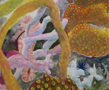
I am on an orange binge with my little abstracts. With lots of textural brushstrokes, unlike the smoothe coral paintings. I have found that if I click "Quick fix" in the Jasc photo shop, the images appear brighter and more true to life than the photo I've taken, although sometimes, or often, I prefer my original. This gizmo-technique really shows; some of the images in the gallery really need it, they reproduce dull, on the Daily Painters page, http://www.dailypainters.com/index.php.
~~~~~~~~~~~~~~~~~~~~~~~~~~~~~~~~~~~~~~~~~~~~~~~~~~~~~~~~~~~~~~~~~~~~~~~

~~~~~~~~~~~~~~~~~~~~"Sad Eye of the Storm" 8X10 inches oil on canvas ~~~~~~~~~~~~
.
So what I did here was one of my little, 8X10 inch abstracts. I put straight on the canvas on one side, three globs of Cadmium Lemon, straight from the tube. On the other side, I put Cadmium Red, again, straight from the tube. Then I shut up the little yakking voice in my head, sometimes called Ego, and quietly observed what my paintbrush did. Swish, swirl.

OK, stop! But it didn't look finished. I set it aside, where I could watch it. I don't feel like I'm looking, I'm watching.

Two days later, it seemed to need circles, or something. Cadmium Orange, squish from the tube onto the painting, and the round pure color made itself into the roundish 'spot'. OK, stop. The name then came to mind.

In dim light, I'm seeing a couple of faces in the brushstrokes, but owell.

I was a bit surprised at how different the orange looks. Then I couldn't decide which way is up, another little painting with four hangars on back! The big surprise came later, after I'd taken the little beast on the porch to photograph it in indirect sunlight. Four images, turning the canvas each time, to see which view showed the prominent brushstrokes to my liking.

Once on my computer, just for fun, I clicked Quick Fix. WOW! see below, same orange painting, two different lightings, two interpretations by a computer program.
.


.
I've never had this happen before. Usually a painting's image just brightens some. But this!! And two different images, depending on the reflections of light off the brushstrokes. But these aren't paintings! Only the orange one exists on canvas.

Now I'm waxing philosophical about 'subtlety'. Does being subtle create more, a great deal more, impact to our minds/brains?

Hmm, I'm going to try this with pure Cadmium Orange, do a realistic portrait using only brush strokes. But I then only one color wouldn't make these differences. Hmmm, How about the pure orange, and a blueish red, and a greenish yellow? Hmmm, how about Windsor Blue, green shade, with Windsor Blue, red shade, with Pthalo blue?

note: Please tell me if I should separate this stuff onto another blog, and keep this blog true to its' name! I think I will, but not today!

Until later, Cheers!

Melissa

Tuesday, May 20, 2008

stuck--unstuck

I figured out why I haven't started on my next 'real' painting. I don't have the right paints. Maybe I have too much knowledge. "Fat over Lean" is a rule in oil painting. Some oil paints are made of pigments that absorb lots of oil to make the 'buttery' consistancy, some take a lot less. If a painting is made with lean over fat, brittle over flexible, the different drying times and qualities make the paint crack. Not something I want.

So the right paints are 'in the mail'. Be here in a few days. I almost feel sorry for the person filling my order, all the colors for underpainting are, umm, I'll be kind and say drab.

Friday, May 16, 2008

Salt River Marina Entrance


"Salt River Marina Entrance" Watercolor 22x28 inches

Another Friday mess! I'll wreck 52 pieces of expensive '300 pound' watercolor paper if I keep this up for a year. I think this one does indeed need tweaking, I haven't really looked at it yet.

Barred Hamlet 2


My 'base photo' for the next effort at an oil painting of a reef scene. Kind of spooky looking, hey? This place is about 90 feet deep, off Cane Bay, St Croix. I will get back to the ray painting before long.

The fish in the lower middle is a "Barred Hamlet" The stripes are generally called bars on a fish if they're verticle like on this guy.

Today the Palletteers, our plein air painting group, is meeting at Salt River Marina. So I guess tonight I'll be posting another messy, 'energetic' watercolor painting. I am miserable while doing watercolors, but I guess it's good for me. groan Boats are so very difficult to paint! Oh, ugh.

And it came to me how to get a straight horizon for future beach scenes: hold up the paper, and let a drip of paint run across it! hahahahaha!

Monday, May 12, 2008

Non-reef paintings done lately.


Title, "You missed the Boat!" Watercolor on Arches 300 lb paper, 29x22 inches, 56x71 centimeters

As I was painting this one, Plein Air on the beach, struggling to paint a straight line for the horizon, a big white Deep Sea fishing boat zoomed by.

I know you stop by here to see fish and coral. The new housing for the new camera didn't come with a major part- the place in front that the lense fits into. ???

I just discovered this yesterday and had a fit, as I was on my way to dive and get fresh perspective and paintable underwater scenery photos. So, once I get done here, it's onto the phone and internet to try to get more bits for the camera so I can take the beast underwater. In the meantime, some topside watercolors, and some of my oil abstracts, and a photo or two.


"Jungle Home Aieeee!" Plein Air Watercolor, on Arches 300 lb paper 22x28 inches, 56x70 centimeters
Painting this one made me crazy for several reasons. I couldn't imagine living in this little cottage, too much gardening to do! And I couldn't control the paints or painting at all, too much detail. Leave this kind of painting for -- what's-his-name that ran away to Tahiti from his banking job? I bought some acrylics just to paint over parts of this, but I've started liking it as it is, even though it's a total mess. this painting makes me laugh.


"Cityzoom" Oil on stretched canvas 8x10 inches, 20x25 centimeters(approximate)

I put at least four hangars on back, so the painting can be turned around to look different. My abstracts never seem to look quite right.


"Heavenward Conch" Oil on stretched canvas 8x10 inches, 20x25 centimeters (approximate)

I'm on an orange kick. And I do name each painting. None of mine will be named "Untitled" Even though this image is mostly orange, one way it looks like waterfalls, another way, the sea.


"Portrait, Thanks Again" Oil on stretched canvas 8x10 inches, 20x25 centimeters (approximate)
The blue line to the right must be a perfect 'complimentry color', because from a distance, it looks like it has brown edges. And my eyes started getting funny, vibrating, while I was painting the blue line. I'm going to explore these colors for a few more paintings, an orange format, with tiny blue lines. Hmmmm.


I grow Brugmansias, Angel's Trumpets. They have a wonderful fragrance in the night. And they're the largest flowers I've ever grown.


My cat, Buzzy Black.


Wonderful Golden Rain trees by the 300 year old Moravian church.

Friday, April 25, 2008

I'll be back soon

Can't believe I've neglected my poor blog for so long.

Just got the new camera, I think it's too much for me, or just not the right one, but I'm learning how to use it anyway. Haven't been in the water for so long.

Thursday, March 27, 2008

I'm such a beginner! Ha!

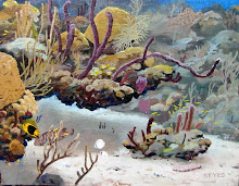
I am really stuck with this painting. It looks like confetti to me. Below is the original photo that I am working from. Blue. Divers who take photos never do this, publish blue pictures. But this is what the camera sees below about ten to fifteen feet, four or five meters, roughly. I was at about thirty five feet of depth when I took this photo.

I am closely reading and making up exercises for myself from a discussion of color by David Rourke, at:

http://rourkevisualart.com/wordpress/articles/color-and-color-mixing/

All for now. I seem to be painting a lot of small abstracts lately. They paint themselves, so much easier, I just hold the brush and watch what the colors are doing. I'll put them on another blog, once I get a new camera. The little 'SeaLife' is broken, booo.

Wednesday, March 19, 2008

Teenie tiny bit more


Some cerulean blue water at the top and around the edges. Anything and everything is easier to do than painting. I mowed the yard today. Grocery shopped.

Anyway, I'm really happy with this blue, am going to put on some more. It makes the painting really "pretty".

Yesterday I went diving for the first time in months. I found this exact place. Proud of me! But now the sea has gotten rough because of a storm far north in the Atlantic, at least two thousand miles away. Sending waves all the way here. For diving, there would be a lot of current, surge, which is a back-and-forth movement of water that can be quite pesky for trying to hold still to take a photo, and the visibility is probably terrible with all the sand and silt stirred up. Here are calm and rough photos, taken yesterday and today.

And one day later. Isn't there a song, "What a difference a day makes? Twenty four little hours..."
I can handle this mess if need be. But when the sea has been calm for months the sediment and fluff settles, and then on the first bumpy day the little particles get all stirred up and you can't see much. Like thick fog.

I've gotten in the water here many times over the years, since the late 1980's, maybe a couple of hundred times, right here. I'm sad that I haven't kept a log of every dive I've ever done. When I read back over the detailed logbooks that I have occasionally kept, I remember each dive like yesterday. Strange phenomenon

Friday, March 14, 2008

Miracle Computer


Black and white AND backwards, funny! This really is a help, thoough, as I build this beast, to analyse the composition, interest points, light and dark and contrasts. I need some things lighter, some darker. I'm using so many photos!

As I dive, I take distance scenery images, as well as specific corals, and fish that turn away just as I press the shutter button. Usually about three hundred shots per dive. I had to buy an external storage device because my poor computer was totally full, I couldn't save one more picture!

Many underwater photographers strive for "ID" pictures, flat, broadside poses so the fish don't look like they know how to move. I see this in other painter's pictures. A school of fish is sometimes one fish painted over and over. Hello? But it's so difficult as to be nearly impossible, or else there'd be lots of paintings and painters of underwater scenery.

I found that someone has the 'coral reef paintings dot com' name. Owell, that's OK. Once I decide to get enthusiastic about producing, and go commercial, IF I go commercial, just a little marketing will get me out there real quick. Too frightening right now for me. Anytime I tell someone that I now have a studio, and am painting, they immediately start in on me about exhibiting and selling. Like as if I have dozens of finished paintings laying around, and can do ten a day. I'm comfortable with only painting a wee little bit every day. I don't know why I don't paint for hours and hours.

Thursday, March 13, 2008

OK


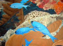
OK, I added a few more fishes. The one I like, and who'll get some friends, is the little Black Durgon up in the right side.

There's such a strong diagonal now, that we need something to anchor the composition, a loose school of Black Durgons, that could easily be there.

Great fish, Black Durgons! Up close, they have gorgeous turquoise designs running around on their faces. I'll see if I have a photo up close someplace to post.